Now that the difference between DEM and SRTM (and other data sources) is clearer, the goal of this guide is to create a contour map using SRTM data we got through Topodata.
How to Make a Contour Map
What is a Contour Map?
This type of map uses lines (called contour lines) that connect points of the same altitude on the Earth’s surface. Using this kind of map, we can get a much better feel for a region’s terrain, allowing for topographic studies, planning for agriculture, and other area-specific analyses.
A key thing for interpreting these maps is this: the closer the lines are, the steeper the slope is. The further apart the lines are, the gentler the slope is in that area.
Making a Contour Map Using SRTM Data
In the previous post, I showed you how to get the SRTM data and download the file for your area of interest. Now we’ll use that data to develop the contour map.
- Go to the Topodata page –> Acesso (Access) –> Google Topodata
- Choose your grid area and download the .zip file for altitude.
Add and Style Your Data in QGIS
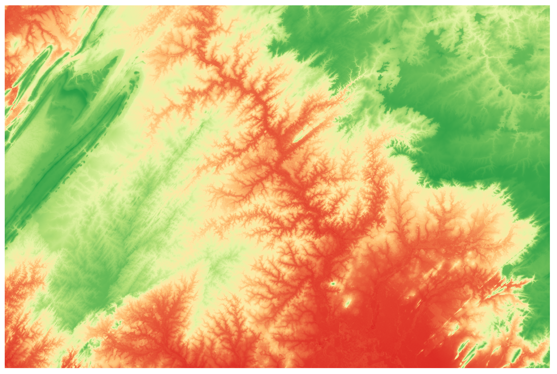
For a more interesting visualization, you can tweak the styling. Change it to “Singleband pseudocolor” and pick a color palette you like. Other things to pay attention to are the method you use to classify the values and the number of classes—keep that in mind for correct interpretation.
Change the Projection
The data you downloaded is originally in WGS84 – EPGS:4326, which means it uses geographic coordinates (lat, lon).
For calculations and analysis, it’s important that we change this to UTM. If you haven’t already told QGIS the original CRS, do that before you make the switch.
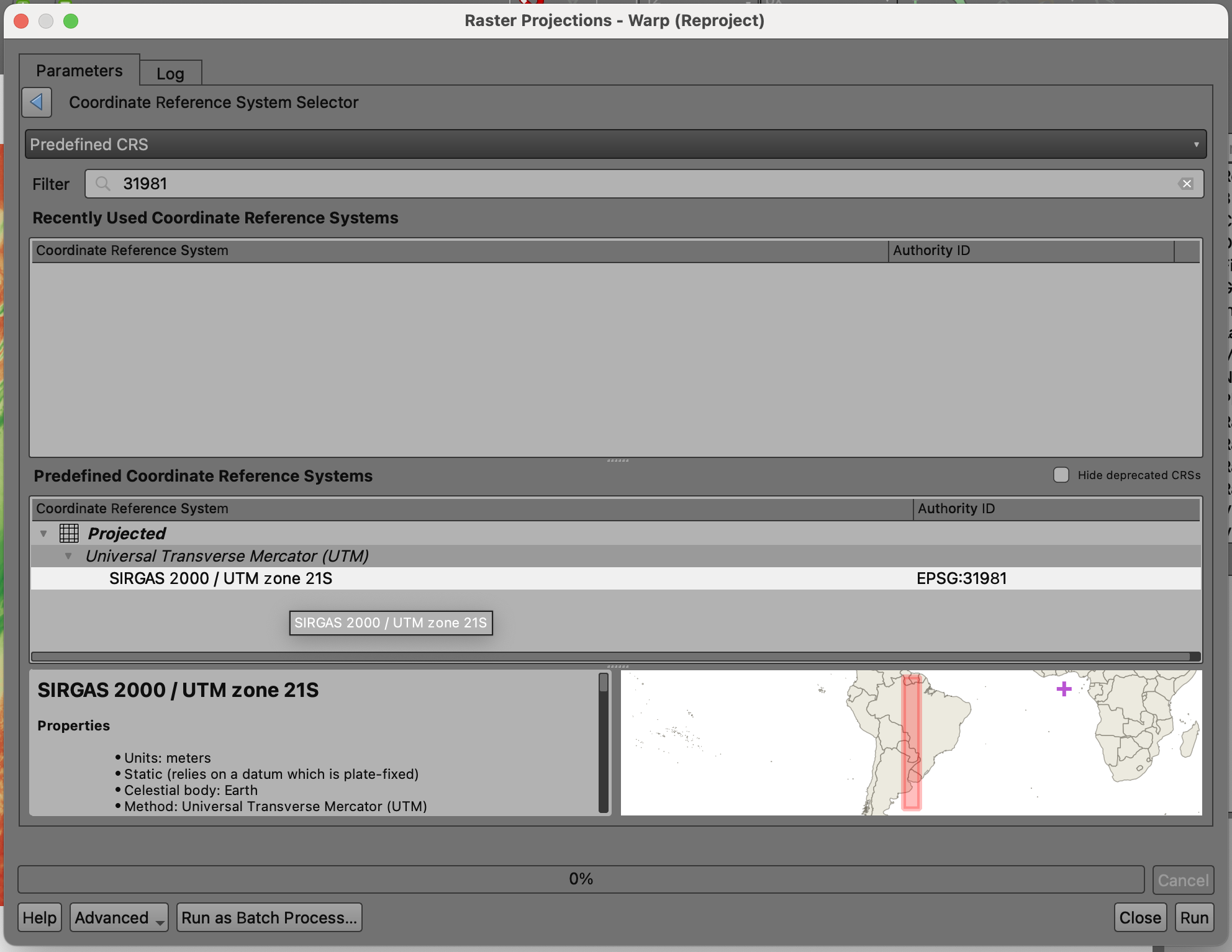
One way to do this is: Raster –> Projections –> Warp (Reproject).
There are other ways to reproject, like Export –> Save as –> and then adjusting the new CRS settings for the file. I usually go with this option.
In the box that pops up, fill in the info. Remember to specify the original CRS and the one you want to transform it to, and save it as a .tif file.
In my case, since I picked a grid containing the city of Cuiabá and nearby areas, I know the corresponding EPSG is 31981 (UTM zone 21S).
Optional: If you don’t want to make the map for the entire SRTM area you downloaded, and you have a smaller region of interest, you can clip the file after you’ve reprojected it.
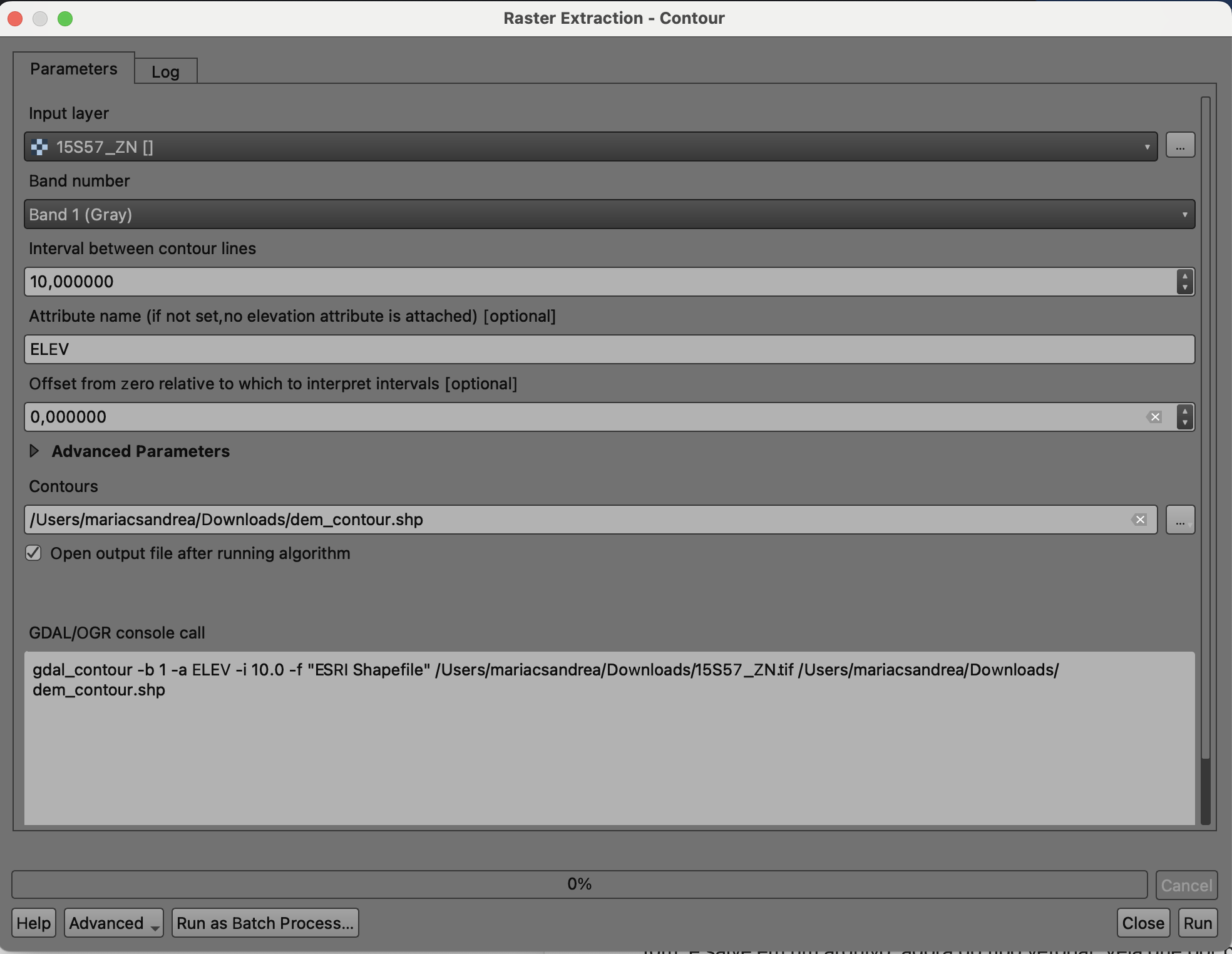
Extracting Contour Lines from the SRTM File
Now we’ll finally get down to the actual contour lines!
Raster –> Extraction –> Contour
Fill in the requested information, keep the line interval at 10 meters, and save it as a vector file this time. You’ll notice that, by default, the attribute of interest will come out as ELEV.
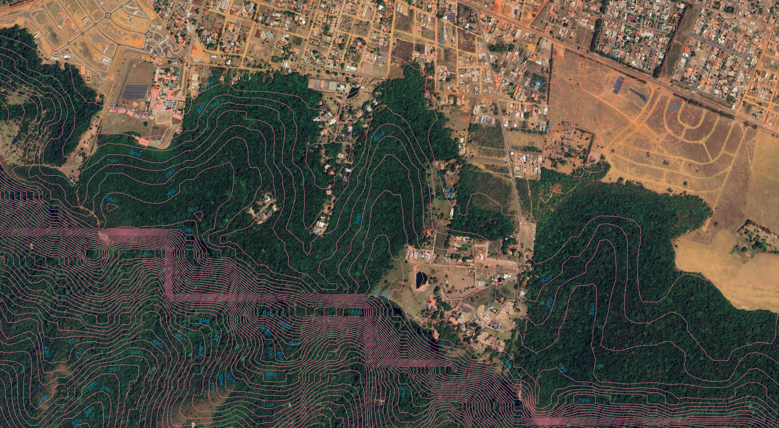
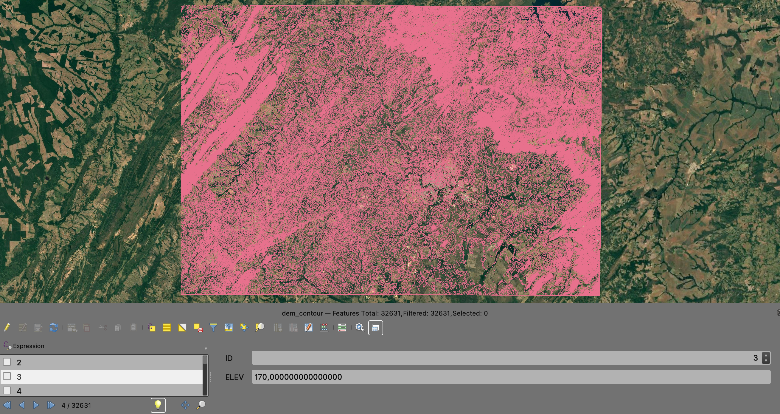
Since I didn’t clip the file, I have contour lines for the whole original raster area. I added a basemap here to make sure of the location and give some context for interpretation.
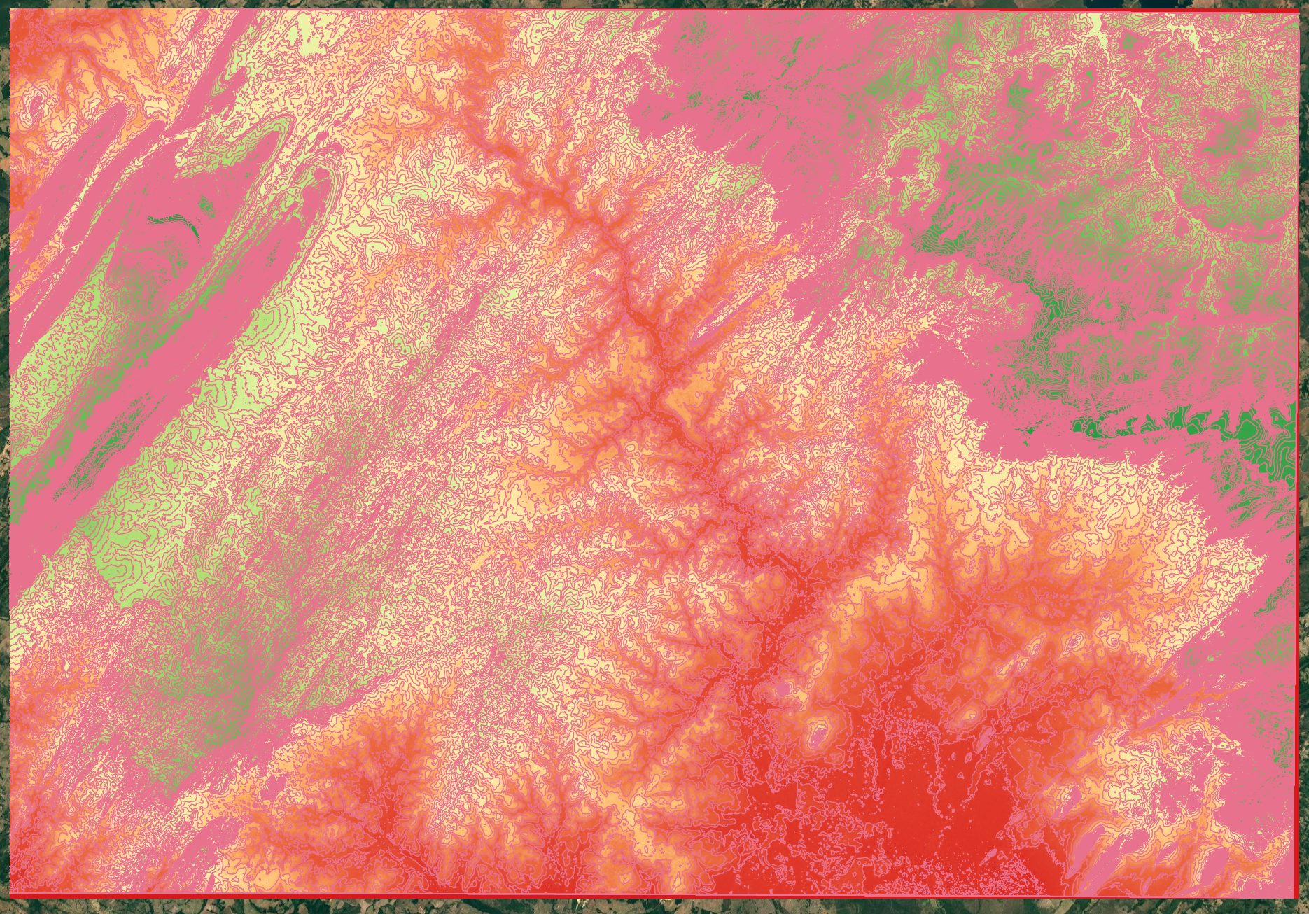
You can also change the styling of the lines now to make your results easier to interpret and view.
Now, if you open the attribute table, it’s clearer that each curve ID corresponds to an ELEV value, which is the altitude of the spot where that line is positioned.
Very close to Cuiabá, we have the Chapada dos Guimarães. If we zoom into that region after outlining the contour lines, the whole “closely packed lines = steeper slope” idea becomes super obvious: you can see the altitude increases significantly over a relatively short distance here. I also added labels in the symbology settings under Labels.